Double Page Magazine Spread
Research
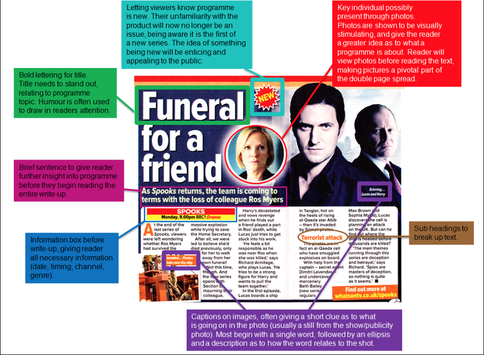
Analysis of Real Magazine Spreads
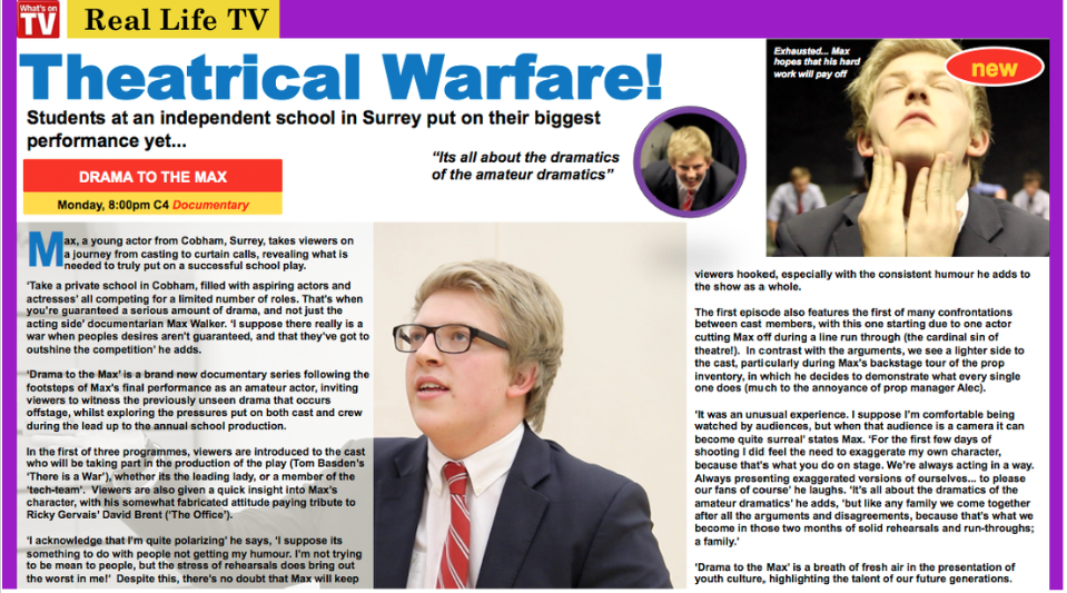
Our Documentary's Double Page Spread
Draft 1
The image seen above is an earlier draft of the double page spread. Draft 1 appeared to fit a majority of the necessary conventions expected for such a piece of literature. Although I found that having the text laid out in blocks wasn't effective, as it didn't recreate the layout of the text in the 'What's on TV' magazine. We decided to change the double page spread so the text was in columns, also adding in the subheadings used in the magazine, which aim to further entice and draw in readers. However, we felt that still didn't have an authentic, realistic look; as the columns weren't the same size, making the layout look particularly untidy. We fixed this by condensing the entire piece, allowing for it to fit the now identically sized columns, which ultimately allowed us to complete the double page spread with the authentic look we sought after.
Final Product
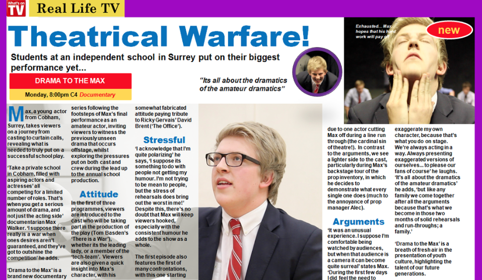
Our double page spread was inspired by the layout seen in the 'What's on TV' magazine, particularly in the 'real life TV' (documentary) section. To follow the conventional layout of the magazine, we kept the border identical in format and colour scheme, giving the piece a very authentic look. The images selected for the spread were used in order to capture the readers attention, due to the visually striking impact images can have. I believed that all three photos encapsulated the documentary's focus on Max as a character, as well as the idea that the series will involve dramatic moments through acting and upsets. The write up aims to promote the series in a positive manner, as this would be the sole purpose of the magazine. Including an interview with Max gives readers a clear insight into Max as a character; allowing for the mode of documentary to shine through. As the documentary was focused on Max, we attempt to duplicate this involvement when it came to the double page spread. I believe we were successful through such measures as using three images, all of which being of Max, as well as beginning the piece with not only a description of Max, but the word itself - Max. Thus hoping to peak the interest of our likely target audience, young adults, and leave them wanting to discover more about Max as a character.
